
Dad & Daughter
A complete rebrand for a family owned American home services company.
The client came to us with a strong challenge: "I want this to be recognizable from the moon." He also wanted to have the feeling of a team, as his aim is to build a business that will help to turn his technicians into wealthy people. We also had two very strong competitors in his service area, and we needed to find a way to be distinct.
We started, as we always do, by listening. Discovery sessions with leadership and the advertising agency. The strategy of the family-owned business was already in place but needed the brand and logo designed to communicate this.
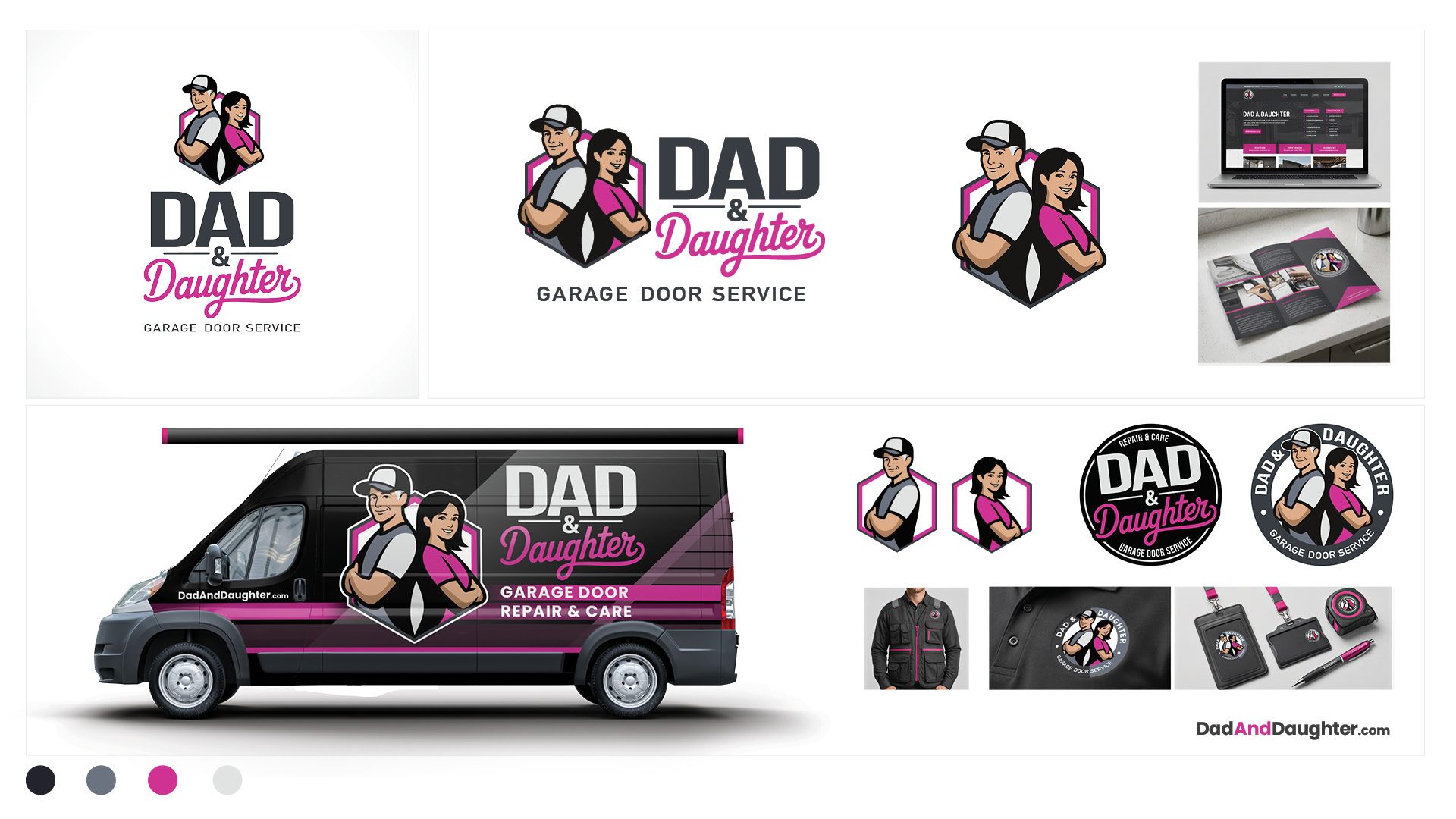
The Dad & Daughter Garage Door Service brand mark captures the company’s unique story and competitive strength. The illustration of the father and daughter communicates partnership, equality, and shared leadership - honoring his hands-on installation expertise and her university-educated business acumen.
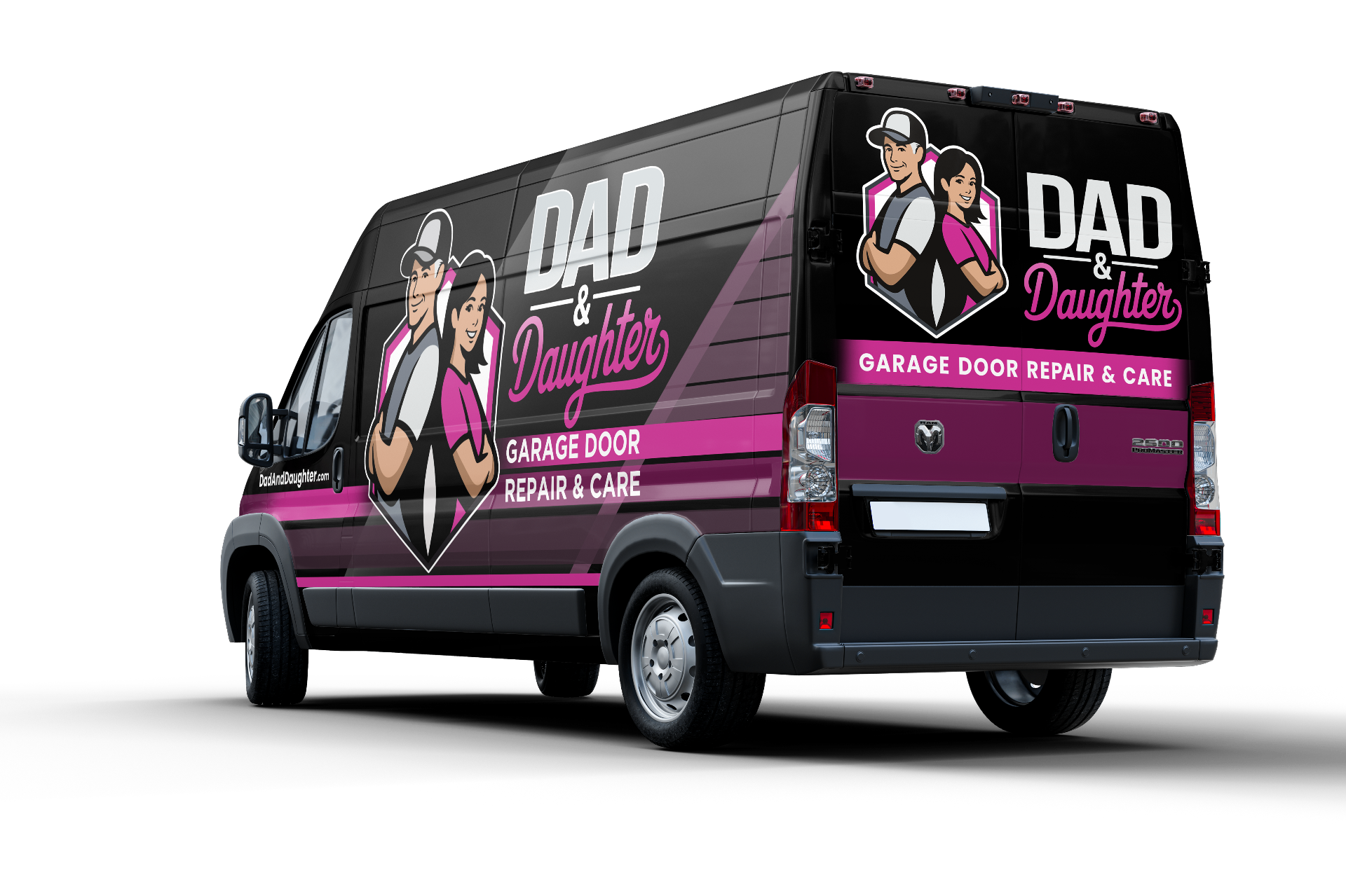
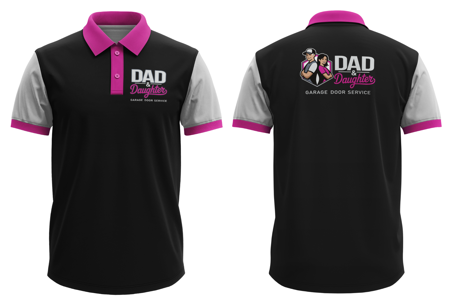
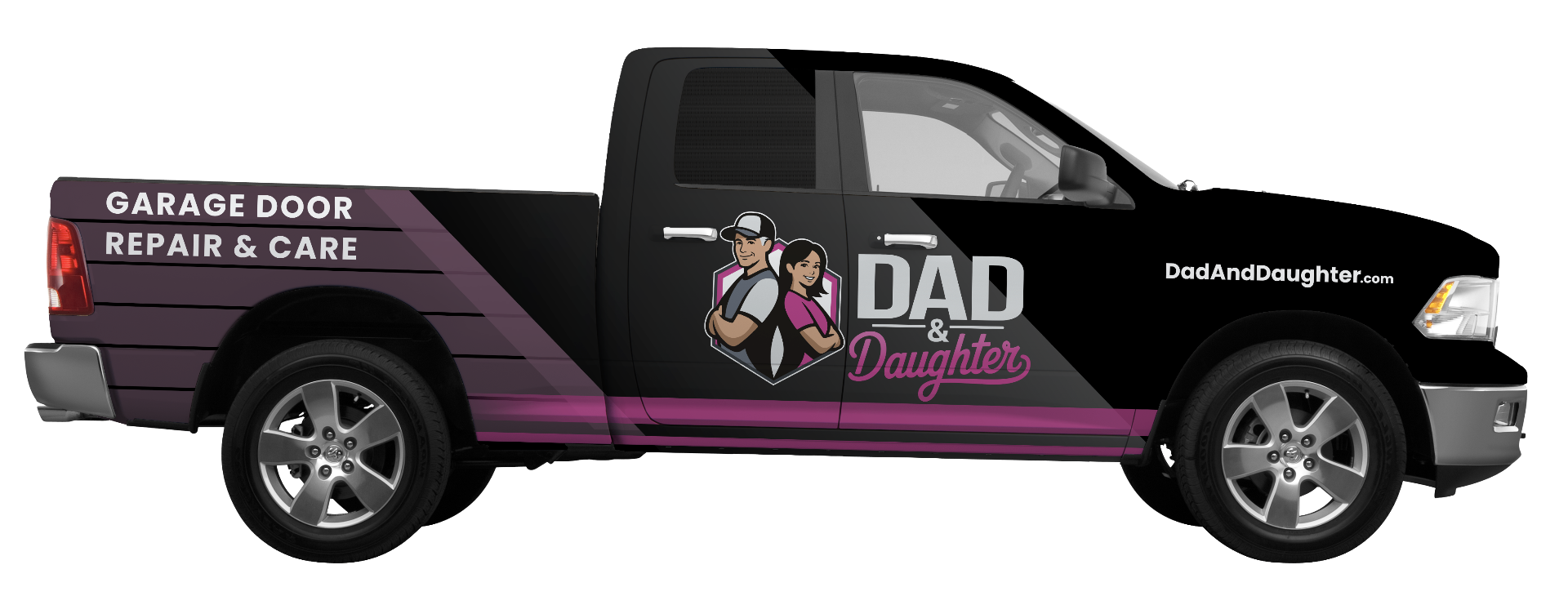
The badge shape conveys craftsmanship, structure, and reliability, while remaining practical for uniforms, vehicles, and signage. Read the full story.
"A complete rebrand for a family owned American home services company."